i think it was 2020 when i first came across the #30 day map challenge on twitter. despite wanting to participate, it wasn't until last november (2023) that i finally put aside my self-consciousness and decided to give it a whirl.
i have a tendency not to do things by halves, more like one and a halves, and saw the opportunity to try and learn some new skills. my self-imposed rules were:
the rules
- do everything in python
- publish all my code on github
i didn't miss a day.
here is a selection. and below my thinking on this selection.
day 3 polygons

i have a soft spot for things with a minimal aesthetic. i had applied[1] this ideal to the maps i made for day 1 and 2 to such an extent that they lacked frames and everything that wasn't the content. they look a bit pants. day 3 was the day i had the realization that if you want your map to look good, you have to put in some effort[2] i added a neat-line; a title that made use of some empty space; and, in place of a legend, a slightly pithy comment that hopefully tells the reader what they're looking at. i also decided that i needed a consistent method of signing my work, and that although these maps are silly little things of no utility or commercial value, it was discourteous not to include data attributions. i also settled on dejavu sans mono as my font.
i chose Finnish lakes because: (a) there are lots of them; (b) i love this ↓ map published by the war office in 1945 (2nd edition, 1948). i picked it up from a table on broadway market (i think) in ~2013 (maybe) for £3 (according to the pencil scribble at the top).


things i love about this map:
- the lakes are in the most fantastic shade of blue
- that i would have tried to colour match on my map - but i couldn't find this at the time.
- the way it spills over the neatline in the south
- the multilingual glossary
- the font used for the title
- the inclusion of local mean time
- the way neighbouring countries are labelled in the margin (and their font)
day 11 retro

here i endeavoured to recreate the style found in old scientific publications, specifically those found in the Journal of Glaciology (e.g. sugden et al., (1985) & sigurudur thorarinsson (1953)). I particularly like thorarinsson's north arrow, and the way the contour lines abruptly stop at the point at which he decided they were no longer needed.
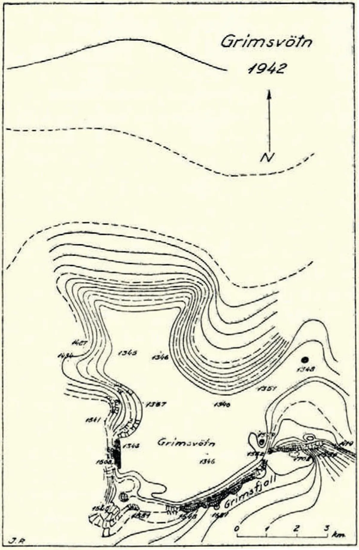
the limitations imposed by only having one colour influences a lot of small decisions. there are, after all, only so many hatch patterns and densities one can use before it looks like a victor vasarely[3]
i probably should have included a legend - and i'm not wholly sure why i didn't.
anyway, the area depicted in my map is the north-western limit of hardangerjøkulen - an ice cap in norway - which i had the good fortune to visit last april, for a course at finse alpine research centre (webcam). whilst the course was very much an indoor affair[4], i managed to sneak out before breakfast for a snowshoe trot around the edge of the ice cap to an ice-marginal lake. here, icebergs calved from Hardangerjøkulen are held fast by the lake's winter ice cover, giving one the opportunity to spend a bit of time in an iceberg.


day 13 choropleth

for a while now i've been a huge fan of 3d ✨bivariate histograms ✨, but this was my first time producing a bivariate choropleth map. and whilst i could should? have done this in qgis or arcmap and made my life easier. that would have contravened rule 1
instead, i spent far too much time:
- trying to efficiently query cogs (cloud-optimised geo-tiffs) to get zonal statistics for each hexagon[5] (thank you to this question and this question, and three cheers for dask).
- wrestling with colour maps (before then discovering this handy bivariate choropleth colour generator).
- following this code for assigning classes
- having first gone down a natural breaks rabbit hole (hooray for
jenkspy)
- having first gone down a natural breaks rabbit hole (hooray for
- stubbornly insisting that the legend must be rotated by 45 degrees. this was a major faff, that i could not have done without this guide, and stack overflow
- i imagine there might be an easier way
whilst my choice of variables to display (hilly-ness and rivery-ness, where hilly-ness is the standard deviation of elevations, and rivery-ness is the length of rivers) does not lead the reader to any novel insights - they are, unsurprisingly, correlated (r = 0.56) - i learnt something.
i also feel that the utility of bivariate choropleth maps might be over-egged. three classes for each variable doesn't really feel like enough, but with four, you jump to sixteen classes in total. effectively discriminating between the classes that lie in the middle of the colour smash legend (okay, so that's only four out of sixteen) becomes quite tricky. i'm shooting my argument in the foot. maybe they're a bit useful.
day 15 osm
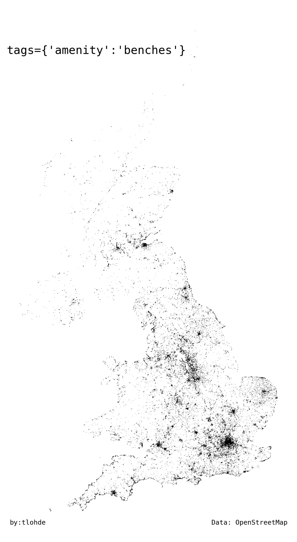
osm is something to be in awe of. just check out their stats. for more than a decade, there have been more than a million new nodes added each day[6]! that is bonkers. and it's free. and many[7] contributors are doing it just for the sheer whizz of doing it. remarkable. contributing to osm has been on my to-do list for some time. alas, whenever i've been captivated by the impulse i've struggled to find an edit that needs doing (and even if i did, i'm not sure i trust myself enough to do a good job). i should probably download street complete and get on with it[8].
beyond the occasional base map, i don't think i've ever used osm data in a proper (whatever that means) project. i do however use it very often. i've had osmand on my smartphone for as long as i've had a smartphone. it's been the map i've used for plotting cycling, running, and hiking routes since a long while ago[9], and for navigating along those routes with osm data loaded onto my handheld gnss[10] device.
↑ that's a long-winded way of saying: i like osm and want to become more familiar with working with it. handily, the 30-day map challenge provided ample opportunity to do so. and there is a fantastically user-friendly python package: osmnx (which also happens to have excellent documentation). creating (an unstyled version of) my map of all the benches in the uk is as easy as...
import osmnx as ox
benches = ox.features_from_place('United Kingdom',
                                 tags={'amenity':'bench'})
benches.plot()
which is just plain silly.
day 18 flow
an incomplete idea that was a good fit for this theme had been quietly lingering in my head for a good chunk of time[11]. i put something together that kind of did what i wanted it to do. and i liked what i'd done. but.
but afterwards i decided i didn't really like it, and that it needed improving. which i have since done. i am intending on writing something about that at some point.
day 20 outdoors

i've had a little look, in vain, a handful of times over the last decade or so for a website that clearly created a lasting impression. it would have been between 2003 and 2005. so, a while ago. it was a primitive version of peak finder or cheechako, or even google earth's viewshed tool. you picked a location on a map and got to see what the view looked like from that point. with distant peaks nicely labelled (in red, i think). unlike more recent versions the resolution was low, the colours bold and paint-as in the software-like (if memory serves me, all the land was very green). i remember seeing what peaks could be seen from my favourite place in the world.
so what? so. the idea of a viewshed tool is, i think, pretty neat. take a digital elevation model, pick a point (and an observer height), run the tool and the output is a binary can-be-seen / can't-be-seen from that point. and if you pick, for example, all the peaks that are within the cairngorms national park boundary (here, all peaks were taken - regardless of height - from osm) and compute viewsheds for each one... you can add them all together to find where is best/worst place to hide.
conclusion
i thoroughly enjoyed making these. that wasn't the objective, but, i suppose, i knew that i would.
i learnt a lot. that was the goal. good. mission accomplished.
what has come as a surprise, that i hadn't anticipated[12], was how much i enjoyed being a little bit creative. i haven't made anything[13] in a long time. i don't consider myself to be creative. but, playing with ideas; being forced[14] to come up with an idea on a theme; and seeing / being inspired by other people's work, felt a little like the uncorking of some latent creativity.
the section after the conclusion
next up[15]: i will gather some contributions from others that got me ticking.
footnotes
lazily applied ↩︎
not that i’m saying my subsequent maps looked good ↩︎
that’s not a bad thing. at all. his work is fantastic ↩︎
machine learning in glaciology since you didn’t ask ↩︎
translation: sneakily calculating statistics for lots of data without downloading all the data ↩︎
i’m not normally one for exclamation marks, but i’ll make an exception here. just this once ↩︎
the majority? ↩︎
in the weeks between writing that sentence and proofreading this post, i have since downloaded the app. but am yet to open it. i might shout about it once i’ve made my first contribution / edit ↩︎
current favourite website for plotting is gpx.studio ↩︎
don’t be wrong. gnss = global navigation satellite system. gps (global positioning system) is just one flavour of gnss. a flavour cooked up by the united states. other flavours include the european space agency’s galileo, or, the russian glonass. odds are, that thing you use to navigate isn’t just speaking to the gps satellites, but some of the other ones too. so…next time you are asked “do you know which way you’re going?” you can confidently, and correctly answer: “yes i have
a paper map and compass and the skills to use them(ed. i mean yes, ideally, but no. wrong. try again.)a gps(ed. no, no, no. have you not been paying attention? try again.) a lovely handheld gnss device” (ed. well done) ↩︎four years? since i spent
a lot oftoo much time manually tweaking a wobbly stream network that was the product of a dodgy raster-to-vector conversion for my undergraduate thesis ↩︎that’s what surprise means. ↩︎
apart from breakfast. and a mess ↩︎
forced in the sense of doing something completely frivolous voluntarily ↩︎
in time. in time ↩︎