colour maps are important[1]. and i’ve mentioned them before. specifically, this paper by thyng et al., (2016) and this library of colormaps by fabio crameri. of course, there are many other resources that i’ve stumbled across and leaned on.
anyway, this isn’t a treatise on colour. i read this post earlier, and watched a few of the videos linked within, which provided me with the motivation required to do a thing i’ve been meaning to do for a while…make a colourmap.
mean colours
relatedly, but not quite. during the #30DayMapChallenge, whilst playing with tanaka contours, i tried to colour in each elevation level using the “average colour” seen within that elevation range from a satellite image. the goal was to create a local version of gist_earth (fig 1)

but my naive attempts (just taking the mean from the rgb channels) ended up looking a bit brown (fig 2).

someone on the internet suggested that clustering would prove a more effective means of averaging colours. so let’s do that.
colour clusters

colour clusters
because sklearn.clusters.KMeans is a quick and easy[2] method of identifying groups (clusters) within n-dimensional datasets, that’s what i used. before tackling the (slightly) harder task of finding average clusters within different regions of an image (as above), i first identified clusters from a single image (fig 3). and by choosing an image that isn’t too colourful, the cluster centroids end up making a reasonably nice sequential[3] colour scheme. after that, it was straightforward enough to drop in any other image i wanted (fig 4 & fig 5)

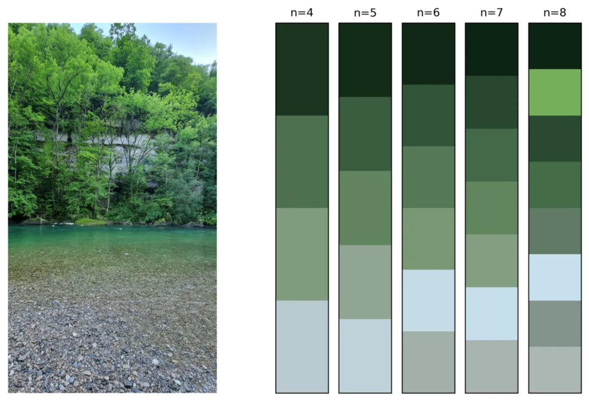
not wanting to give too much time to this deviation, i thought the colours needed ordering somehow. once the cluster centroids had been found i did a hasty conversion from rgb to hsv then sorted the centroids by the s (for saturation, i think) in hsv. this works most some of the time[4].
averaging isn’t too brown

between when i first started working on this post a week or so ago and now[5], i have mucked around with the code used to make fig 2 to such an extent that i now cannot replicate it. worse still, the new code that averages the rgb channels is actually doing an okay job – in fact – it might be better than clustering (fig 6). i also dabbled with the median (fig 7), and that seemed to work quite nicely.

to do
here, the contour intervals aren’t equal. i used natural breaks. which, as it happens, doesn’t matter. getting the elevation range of each band is trivial. and so...
-
dig into the documentation for
sklearn.clusters.KMeansto see how the cluster centroids are calculated[7]
diversions in, and around, colour space
despite what i said a moment ago, i might have just lost a few hours to reading about colour spaces. and, despite not having a clue what this figure[8] is about. i love it. just look at the multitude of hatching. and that font. i’m sorry my figures aren’t labelled as such.
anyway, the above clustering and averaging all happened in rgb colour space. this wasn’t a terrible idea. after all, the multi-spectral instrument on board sentinel-2 has a red, green and blue spectral band. but…well. maybe cielab space is the one that i ought to be working in.
a thought
perhaps the geometric mean is more appropriate. these colour spaces aren’t linear.
the future
skimage.color has a wealth of colour space conversion functions. i will pursue this avenue further. just not right now[9].
footnotes
they are ↩︎
it’s all relative ↩︎
here, i’ve just picked images that i thought would make good sequential palettes. a qualitative palette might require be hard to derive from a landscape (as in, of a landscape, not the orientation) image ↩︎
fig 5: n=4; and fig 4: n=7; n=8, for cases where it did not work ↩︎
as in 8th June 2024 23:56 BST ↩︎
that was the whole point of this ↩︎
is it just the mean? or something fancier? setting n_clusters=1 yields something that looks suspiciously similar to the mean average. but i eyeballed it. rather than checking properly. which wouldn’t have taken very long ↩︎
which is discussed in the article on hsl and hsv, but originally comes from this patent ↩︎
as in 8th June 2024 15:44 BST ↩︎